My sister is heading to China for a mission trip during the last week of October, and I wanted to do something that would encourage her during her time away from America. I hope it will not only encourage her, but that she shares her love & knowledge of Christ with others there in China.
I started off with about 10 index cards....
...and folded them in half.
These are the two compilation scrapbooks I used throughout the making of the book & box (which you'll see near the end).
I used Craft Bond Rubber Cement, Wrinkle Free, and Acid Free for the whole project. The cardboard squares were scrap from one of my husband packages he received in the mail at one point. Those two scraps were the bookends, so-to-speak, for this project.
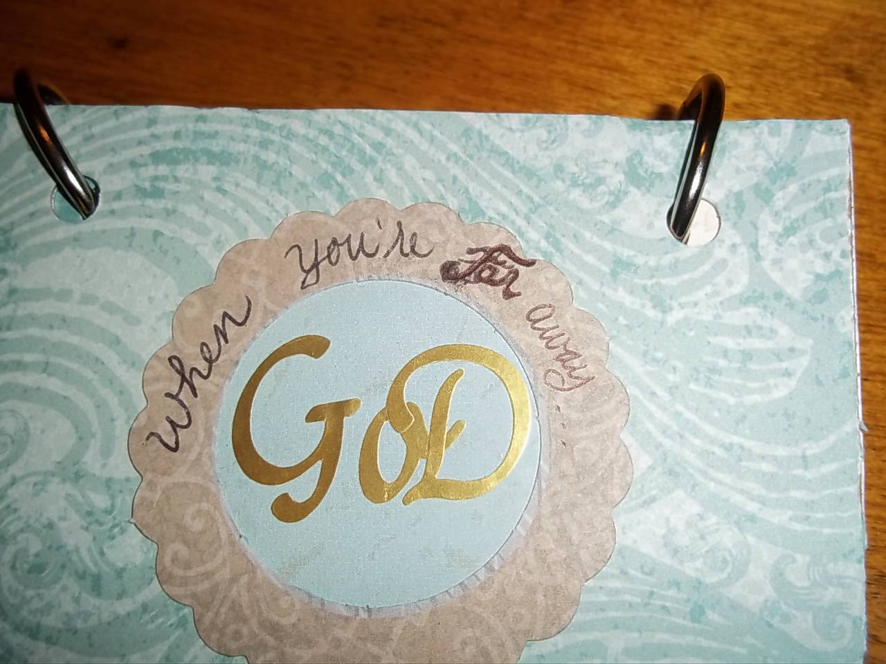
This is the front of it. It reads..."when you are Far away...GOD is near"
I went online and found encouraging verses with the topics of evangelism, help, hope, discipleship, baptism, and many others as you will see in the many pictures below. I took those verses and transferred them into a word document where I gave the title a differing font for each one to make it a little more exciting :-)
And the process of cutting out the verses...
and now, just about to start arranging pretty paper with appropriate coloring....
BUT. Here's the finished box in which I put the completed book. I figured my sis would like a nice presentation..okay, well I wanted it to look nice ;-)
This is actually a cell phone box that I decorated with paper from one of the compilation scrapbooks I mentioned earlier. The oversized flap was actually holding the phone info inside the box--I cut it and cemented it to the top of the box for easy opening. "Wisdom" and the 2 corner tags on the flap were punch-outs.
Inside the box...
A greeting on the inside flap.
The finished project!
I purchased these "book rings" at Kroger, believe it or not.
The following photos are of all the pages in the book. Enjoy!
One of the mistakes I made was not making the hole-punches until I was done.
As you can see, and will see throughout, the holes cut out parts of words.
Next time I'll try to remember to hole-punch first, then start creating.
I used metal paper at the bottom to cover up the whiteness of the index card.
This is about where I started running out of rubber cement...
Thankfully our small town has a Kroger, and they have it!
Another mistake: putting words on words. I thought it would work out okay because the original font on the paper was barely there and extremely difficult to read. However, I should have made my font (that I printed onto that paper) much larger.
I will try to remember this next time.
Mistakes that fix themselves: here, I did not "return" on MS Word thoughtfully because the sentence length did not fit on this square. Solution? I just cut them to fit. It adds visual savvy I think. I use this method later because of the same mistakes-fix-themselves situation.
I wanted to encourage many aspects of the Gospel within this book.
I remember when I was on my mission trip in Jamaica, I would have
really appreciated something like this.
Here is another way to improve a mistake: if the last word or phrase of a sentence doesn't fit,
make it be the accent of the page.
These letters are punch-outs. Nick suggested that I use different colors for the "O"
and I LOVE it!
For these verses, I like how I made a mistake because the one body with many parts is exemplified artistically through the separation of these sentences.
"When knowledge isn't enough..." because love is more.
This is the back "bookend" to the project.
"He is always with you"
and a stick that says "enjoy the journey".
*Now Nick & I get to give this to her today :-)